The work

Whitney Peak & company / Reno, Nevada

Four brands.
One relationship.

A hotel, a restaurant, a climbing gym, and a concert hall. The work follows what’s happening across the property.

The weekly admat sets. The signs in the building. A new menu, a food shoot, the next website. A continuing creative partnership with a lot of moving parts.

The relationship
Ongoing creative support across Whitney Peak and its connected brands
Selected work
2015–2026 archive & current reviews
Studio
Duckfat & Chorizo
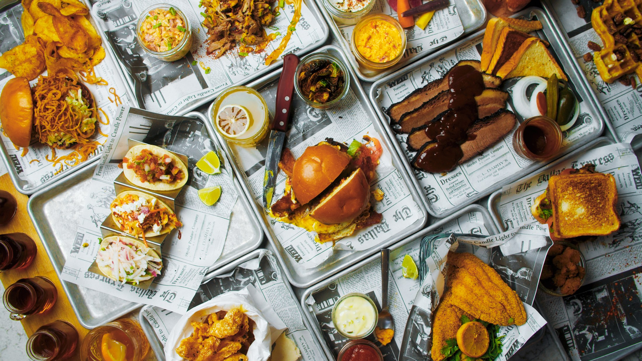
Whitney Peak / Project lifestyle photography, 2019.

A place with some personality.

The work has room for humor. It also has a job to do.

Café Whitney / Campaign archive, 2021
01

The weekly rhythm.

The week,
in every format.

A show calendar becomes a connected set of assets: grid carousels, stories, a one-sheet, and print.

The work has to stay recognizable as names, dates, offers, and practical details change. It’s a recurring creative job, carried through the formats people actually see.

Cargo / Selected admat family

One calendar. The whole set.

Late September 2026 archive
Show dates and offers are historical.

Grid / feed / September 2026 archive.
Story / one-sheet / September 2026 archive.
11 × 17 print / September 2026 archive.
Show calendarGrid & carouselStories & one-sheetPrint & QR
An earlier matching set / July 2025
Grid / feed / July 2025 archive.
Story / July 2025 archive.
Letter-size print / July 2025 archive.
Whitney Peak / Hot August Nights campaign creative, 2026. Historical offer; supplied car photography.

Across the property

A room promotion.
A show announcement.
The next useful update.

The campaign work moves between audiences without making every brand look the same. The hotel’s room-and-parking offer has a different voice from Cargo’s show calendar.

Each still needs the practical information to land: what’s happening, when, and what someone should do next.

02

In the building.

Useful,
where it matters.

Directions, opening conditions, sauna rules, the message at the front desk. The relationship reaches into the spaces guests actually use.

Signage needs to be clear at a glance and feel like it belongs to the place. Here, BaseCamp’s bold type and lime accent carry through a family of everyday operational signs.

BaseCamp / Deck sign. Delivered artwork, April 2026.
BaseCamp / Outdoor-climbing closure sign. Delivered artwork, April 2026.
BaseCamp / Sauna sign. Delivered artwork, April 2026.
Whitney Peak / Elevator floor-directory artwork, July 2024. Shown as original design, not an installation photograph.

Finding your way

A small piece
of the whole stay.

A floor directory connects the parts of the property. The same attention shows up in guest-room collateral, banners, and the signs that answer everyday questions.

The work includes the practical choices around a piece: hierarchy, placement, visibility, and preparation for its intended format.

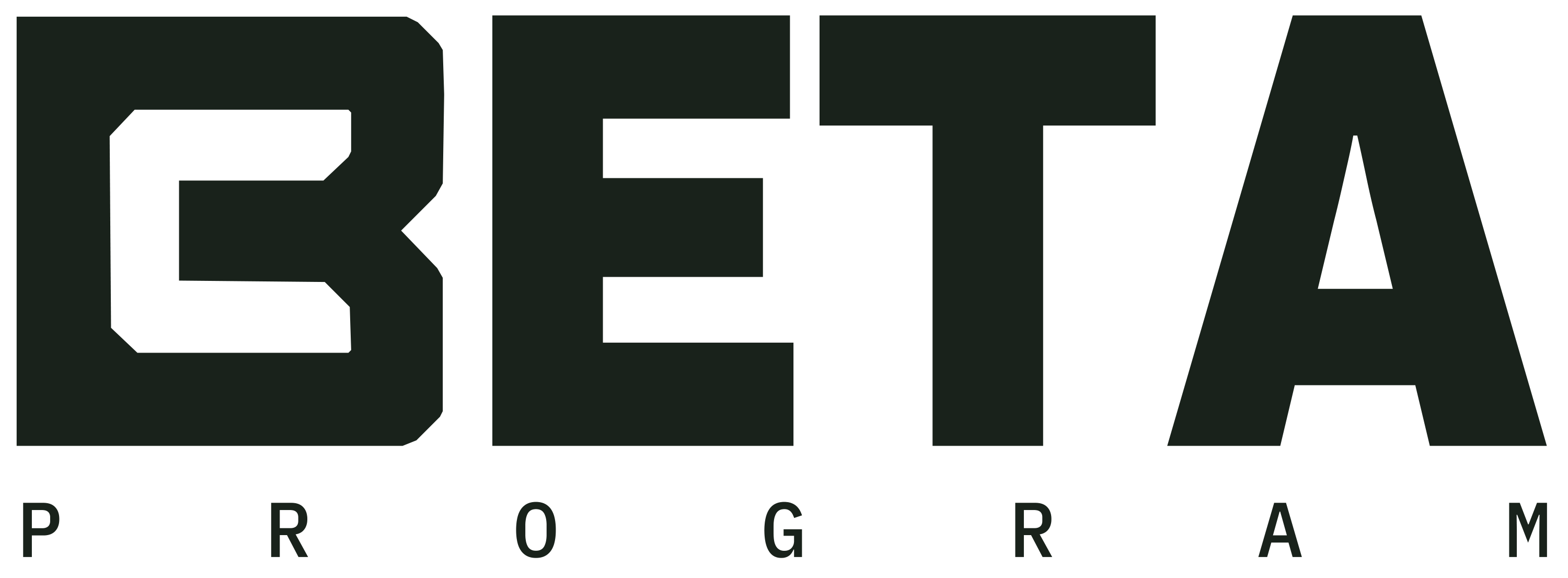
BaseCamp BETA Program mark

Room for a new program.
The 2026 BETA identity extends the existing BaseCamp mark. A related part of the work, with its own purpose.

03

At the table.

The restaurant changes.
The work carries on.

Heritage. Roundabout Grill. Café Whitney. Different restaurant chapters, with food and hospitality running through the work.

Menu consultation, design, project photography, and campaigns sit alongside the regular revisions that keep the materials useful. These archive selections show some of that continuity.

Heritage / Dinner menu, 2015 archive. Historical menu content.
Roundabout Grill / Children’s menu artwork, October 2017. Extracted from the original design proof.
Café Whitney / Dinner-menu production and revisions, April 2026. Historical content and prices.

Café Whitney / Original identity package, 2020

A name. A signature.
A place of its own.

The Café Whitney identity is part of the relationship, too. A loose signature and open frame carry through the original logo package, with horizontal, stacked, one-color, and reversed versions.

Café Whitney / Signature, frame and color system. Original final-package artwork, 2020; newly arranged for this portfolio.
More from the original lockup system
Café Whitney / Horizontal and stacked lockups from the original 2020 identity package. Final-package variants; use of each variation is not separately asserted.

Café Whitney / Campaign archive, 2021

From photograph
to campaign.

The same plate, carried through a brighter color treatment and a bold advertisement layout. The source files show the work between the photograph and the finished composition.

Café Whitney / Street Taco Trio artwork, 2021. Actual publication placement is not asserted.
04

The guest experience.

A little personality
goes a long way.

The hotel’s character shows up in the smaller encounters: the thing on the door, the card in the room, the way an ordinary instruction is phrased.

The photography and collateral allow that personality to feel like part of the stay.

Whitney Peak / STAYhydrated and in-room dining collateral, photographed in 2016. Original project application photograph.

The details, in place

Part of the room.

The real guest-room photograph puts the design in context: a useful message, a menu within reach, and the brand carried into the day-to-day experience.

The CamelBak identity, product design, and hotel furnishings retain their separate authorship.

Drake door hangers / Archival artwork

A guest detail with a life of its own

Beyond
the door.

A familiar meme turns an everyday housekeeping message into a little moment of recognition.

In September 2019, the Drake-style door hangers circulated in Reddit discussions on r/memes and r/FellowKids. Commenters identified Whitney Peak Hotel.

A small part of the guest experience became something people talked about beyond the property.

Artwork & source notes

The artwork shown is from the DFC archive; it is not a reproduced Reddit photograph. A 2018 redesign proof provides an archive date, without establishing when the idea first originated.

The linked posts document circulation and discussion. Indexed vote counts are snapshots, not a measure of impressions or unique people; no audience or booking total is claimed.

DFC’s contribution is the guest-collateral design and application. Drake imagery and the original meme have separate origins.

Another part of the archive / The Fonz idea, shown in the 2026 portfolio refresh.

The older work still has a voice

Keep the wit.
Give it room.

The refreshed presentation retains the original joke and the blue-and-white character, while giving the type, paper, and two-sided format a clearer showing.

New presentation study, original concept. The historical artwork remains distinct from this mockup.

A note on the hotel’s Nicolas Cage moment

Whitney Peak’s sense of humor also reached the press when the hotel team filled a guest room with Nicolas Cage pictures. The contemporary coverage belongs to the wider hotel story; the design examples above document the guest-collateral side of the relationship.

Read the contemporary coverage

05

The next web chapter.

Four experiences.
Clear ways in.

Stay at the hotel. Eat at the restaurant. Climb at BaseCamp. Catch a show at Cargo.

For Whitney Peak, this is the third website update in ten years. Earlier BaseCamp and Cargo sites are part of the relationship, too. The current work gives each experience a distinct voice and a practical path through the information people need.

Whitney PeakStay
Café WhitneyEat & drink
BaseCampClimb
CargoCatch a show

Whitney Peak Hotel / Website design review

Put the place
into the first impression.

The hotel direction brings Reno, the building, and the stay into one clear introduction. The responsive layout keeps the room-booking entry visible as the page narrows.

Open the Webflow review
Whitney Peak Hotel / Desktop view, October 2026. Actual Webflow staging capture.
Whitney Peak Hotel / Narrow-screen view. Actual resized-browser capture, October 2026.
Room-search interface / Date-picker preview, October 2026.
The booking path, in view.

The date-picker interaction is shown here in the actual review build. It opens and closes as a preview; confirmed reservations still use the hotel’s reservation page.

Cargo Concert Hall / Website design review

The show is
the starting point.

A distinct cream-and-red identity, venue footage, and a direct route into the calendar. The show information needs room for artist imagery and the details that can change after an announcement.

Visit Cargo
Cargo Concert Hall / Desktop view, October 2026. Actual Webflow staging capture.
Cargo Concert Hall / Narrow-screen view. Actual resized-browser capture, October 2026.
Show calendar / Filters and venue-change information, October 2026.
Useful when plans change.

The calendar brings filtering, show dates, ticket routes, and a visible venue-change notice together. The captured Rasmus notice is a real example from the October 2026 review, not a fabricated interaction.

BaseCamp / Website design review

Make the first visit
easier to understand.

The climbing site keeps its own visual pace. Passes, waivers, gear, and arrival information form a clear sequence, with routes into the different ways to climb.

Open the Webflow review
BaseCamp / Desktop view, October 2026. Actual Webflow staging capture.
BaseCamp / Narrow-screen view. Actual resized-browser capture, October 2026.
First-visit information / Actual redesign review, October 2026.
Before the first climb.

The actual first-visit section brings the pass, waiver, rental gear, and orientation steps together. Its anchor navigation was checked in the review build; no pass or waiver was submitted.

These are current design-review materials, not a claim of production launch. All three are actual captures from their Webflow redesign review routes. Café Whitney’s redesign remains in review, alongside ongoing menu and content work.

06

The work between projects.

A familiar place.
A useful working rhythm.

The longer relationship is made of the big public-facing pieces and the next small thing that needs to be right.

A changed menu. A revised show date. A new program. The export, the link, the website update. Knowing the property makes those jobs part of a connected body of work.

01 / Food & beverage

Menu to website.

Spring and fall 2026 menu revisions carried through layout, export, and corresponding website work.

02 / Shows & occasions

Calendar to asset set.

Social and print adaptations, QR routes, email layouts, and the practical updates around a changing show calendar.

03 / The property

Question to useful piece.

Operational signage, guest collateral, sales communications, and program identities within the same continuing relationship.

The work
keeps going.

A creative partner who knows the business, the archive, and the next thing on the list.

About ongoing support
Project details & archive notes

Our ongoing creative support includes the original Café Whitney identity, menu consultation and design, campaign and concert artwork, social and print adaptations, email creative, operational and wayfinding signage, guest collateral, program identities, and website design and updates.

Photographs are genuine files from the DFC project archive. Individual photographer credits are not inferred from blank metadata. Artist and promoter imagery, third-party character photographs, CamelBak product imagery, parent-brand marks, interiors, and furnishings retain their separate authorship. No sole-authorship claim is made for these components.

Historical menus, show dates, prices, offers, signs, and amenities are shown as portfolio evidence, not current information. Delivered artwork and completed design tasks do not by themselves establish installation, media placement, or production launch. Website reviews and 2026 portfolio mockups are labeled accordingly.

The restaurant examples are dated archive selections, not an asserted start date for the relationship. The taco campaign is from the 2021 archive; the original photograph’s camera date is May 2020. The 2016 guest-room image is a photographed application. The hotel lifestyle photograph is from July 2019.

Drake circulation is supported by the dated Reddit links. Indexed vote counts are not used as reach or audience metrics. No bookings, sales, impressions, or other commercial outcomes are invented.
02 / The Beeman Hotel

Room for
personality.

Next story