Selected work

The Beeman Hotel / Dallas, Texas

One hotel.
Two personalities.

Smoke and comfort at Seely’s Mill. A different kind of evening at Rhapsody Room.

Distinct identities, property-wide photography, and short films about the places, plates, and details that bring them to life.

Scope
Identity · Menus · Property & food photography · Film
From the archive
2020
Studio
Duckfat & Chorizo
Seely’s Mill / Food & beverage photography01
01

Different characters.
A shared address.

Each with
its own voice.

A hotel’s restaurant and lounge have their own stories to tell. The identity work gives each a character while keeping the wider family in view.

For Seely’s Mill, a loose script and a drawn mill wheel sit alongside cream and olive. Rhapsody Room takes a more evening-minded turn with expressive lettering, a monogram, deep teal, and warm gold.

Seely’s Mill

Script, mill-wheel mark, and a warm, earthy palette.

Rhapsody Room

Lettering and a monogram with an after-dark character.

Inside the identity work

The thinking
before the mark.

Two distinct identities for two different experiences within the hotel. The original working decks show the range explored, and the archived applications show where those ideas went.

01 / Seely’s Mill

Seely’s Mill,
from the first marks.

A family mill story, translated into a wheel, a handwritten name, and a tactile identity with its own place inside the hotel.

The story behind the wheel

A family history.
A character of its own.

An early Beeman family gristmill on Apple Creek in Illinois gave Seely’s Mill its starting point. The history became a wheel mark and thin, handwriting-inspired lettering.

Wood grain, paper, and burlap references gave the direction a sense of touch. A speakeasy influence connected that history with the hotel’s music-driven atmosphere.

History into identity / Original presentation
Original lettering studies / Development deck, page 2

01 / The lettering

Finding the hand.

Thin script gives the name the feeling of a handwritten note. Weight, flourishes, spacing, and the shape of the M were refined to balance character with clarity.

Six alternatives sit together on the original yellow and forest-green fields, making the differences easy to compare.

02 / The shape

Contained, or left open.

A circular badge gathers the name into a compact shape. The freestanding script lets the lettering carry the character on its own.

Circular badge / Identity exploration
Freestanding script / Identity exploration

03 / The motif

Giving “Mill” a picture.

The wheel keeps the mill story visibly present. A front-facing treatment and a dimensional illustration explore two ways to pair the symbol with the script.

Front-facing wheel / Original exploration
Dimensional wheel / Original exploration
Original material references / Development deck, page 6

04 / Color & material

A tactile direction.

Pale yellow and rust sit beside deep green and two blues. Woodgrain, paper, water, and woven fabric appear together in the original texture references.

  • #F6DFA4
  • #843C20
  • #163029
  • #002B49
  • #76A3B5

Palette from the original deck. Texture imagery is a reference moodboard, not DFC photography.

Supplied Seely’s Mill identity / Repeated in the November 2020 menu

05 / Into the application

The wheel carries through.

The supplied mark and dinner menu retain the dimensional wheel, paired with a simpler script than the exploratory lockup above.

The same core ingredients carry into the menu: the wheel, the handwriting, and the warm, understated palette.

See the original menu artwork

The identity comes together

Green on beige.
A place in the family.

The selected system brought together a freestanding wordmark, a dimensional wheel, and a combined lockup. Warm beige and green gave Seely’s Mill its own character while fitting beside Rhapsody Room and The Beeman’s existing identity.

Selected identity system / Original presentation
More from the original deck
Original wheel studies / Development deck, page 4. Historical reference text is reproduced from the source.
Original palette page / Development deck, page 5

02 / Rhapsody Room

Rhapsody Room,
letter by letter.

A different voice within the same hotel: expansive lettering, compact monograms, and a geometric framework explored across the original deck.

Radial emblem / Original identity exploration

01 / The first directions

More than one way
to say the name.

The deck moves from fine geometric lettering to bolder display type and sweeping script. Those alternatives change the room’s voice without changing its name.

The radial emblem is one of the explored directions: the letters held within a larger geometric construction.

Original lettering alternatives / Development deck, page 9
Tall lettering / Original exploration

02 / From name to signature

A smaller mark,
with its own presence.

The full name and the compact marks are developed together. Circular, diamond, and open constructions test how the identity changes when there is less room to work with.

Wordmark direction / Original deck, page 3
Circular R direction / Original deck, page 3
Original geometric pattern / Development deck, page 13

03 / Palette & pattern

Warm color.
A geometric counterpoint.

Cream, mustard, olive, rust, and charcoal give the deck a consistent setting. Repeating lines provide structure alongside the more fluid lettering.

  • #EAE3CE
  • #CCA54E
  • #77734F
  • #843317
  • #26292B

Colors and pattern from the original development deck, page 13.

Color, texture, and further monogram studies
Original material references. Reference imagery, not DFC photography.
Original lettering and monogram studies / Development deck, page 7
Archived identity presentation / Wordmark, monogram and sign image. No installation date or formal approval date inferred.

04 / From study to application

The direction
carries through.

The archived identity presentation repeats the expressive lettering and circular R found on page 3 of the working deck.

It brings the wordmark, the compact signature, and a sign image together. The lounge photography below places the identity work within the wider Beeman project.

See the lounge photography

The original decks record design exploration. Links to the archived applications are based on the artwork itself; they do not establish a formal approval date. Reference moodboard imagery is identified separately from DFC project photography.

03

Seely’s Mill / Menu photography.

The food,
in its own right.

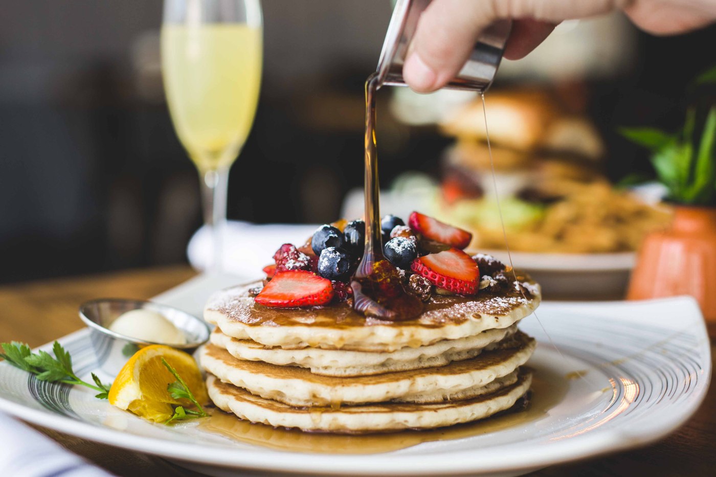
A dedicated menu shoot for Seely’s Mill, built around the dishes themselves.

The styled stills give each plate its own space, with marble, newspaper-lined trays, and a consistent view from above. They sit alongside the menu design and the restaurant spot as another part of the Seely’s story.

04

The feeling
of being there.

Rooms, light,
and atmosphere.

The photography extends across The Beeman: guest rooms, public spaces, Seely’s Mill, Rhapsody Room, and meeting and convention spaces.

A property-wide image library, with the same attention to the room, the light, and the way each space is used.

Seely’s Mill / BarFood & hospitality photography
Rhapsody Room / LoungeInterior photographic composite

Across the hotel

Rooms. Public spaces. Places to gather.

Guest roomProperty photography
Public spacesProperty photography
Meeting spacesProperty photography
Banquet spacesProperty photography

Selected delivered property photographs, including photographic composites from the original archive. Photography: Duckfat & Chorizo.

05

The place, in motion.

A little more
of the atmosphere.

Two selections from a wider series of spots: one through The Beeman Hotel, one around the table at Seely’s Mill.

Part of the broader Beeman project, alongside the identities, menu work, and photography.

01 / The Beeman Hotel · 2020

A look around.

Spaces, details, and the feeling of a stay, brought together in a thirty-second spot.

Visual description

The camera moves through the reception and lobby, artwork, pool, guest rooms, and lounge areas. Aerial views show the hotel and surrounding city. The bar, Rhapsody Room, and event rooms follow. The film closes on The Beeman Hotel logo.

02 / Seely’s Mill · 2020

Around the table.

Food, drinks, and the small gestures of sharing a meal, seen from above.

Visual description

An overhead view of a pale stone table. Hands set down and share tacos, sandwiches, waffles, meat platters, and other dishes. Drinks are poured, garnished, and raised together. The table fills with plates before the film closes on The Beeman Hotel logo.

Also in the series: 15- and 60-second hotel cuts, plus a 60-second meetings-and-events spot. The two films above are the selected portfolio presentation.

The work, together

More than a mark.

Identity, menu, photography, and film give these two spaces a coherent set of materials to work with, from introducing the experience to showing what’s for dinner.

Work with DFC
Project details & archive notes

Our work brought together subbrand identities, menus, property photography, dedicated Seely’s Mill food photography, and project films. The photographs cover guest rooms, public areas, the restaurant and lounge, and meeting and convention spaces. Original film soundtracks are preserved. The Beeman parent identity, interior design, furnishings, and depicted artwork retain their separate authorship.

Original project work is historical, from 2020. The identity-development presentation is newly composed in 2026 from selected original vector artwork, with an AI-generated paper backdrop. Exploratory marks are shown as development, not as a claim of final selection or production. The menu is the November 2020 archive version. Photographs are labeled where the archive identifies a retouch or composite. No sales, booking, or campaign-performance results are asserted.

This case-study draft uses the original project materials. Final public captions, credits, and reuse permissions remain subject to review.

03 / Roundabout

Always something
cooking.

Next story